HELP KIOSK: HELPING OLDER ADULTS LEARN TO USE SMARTPHONES
interaction design | wireframe | testing
Problem
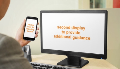
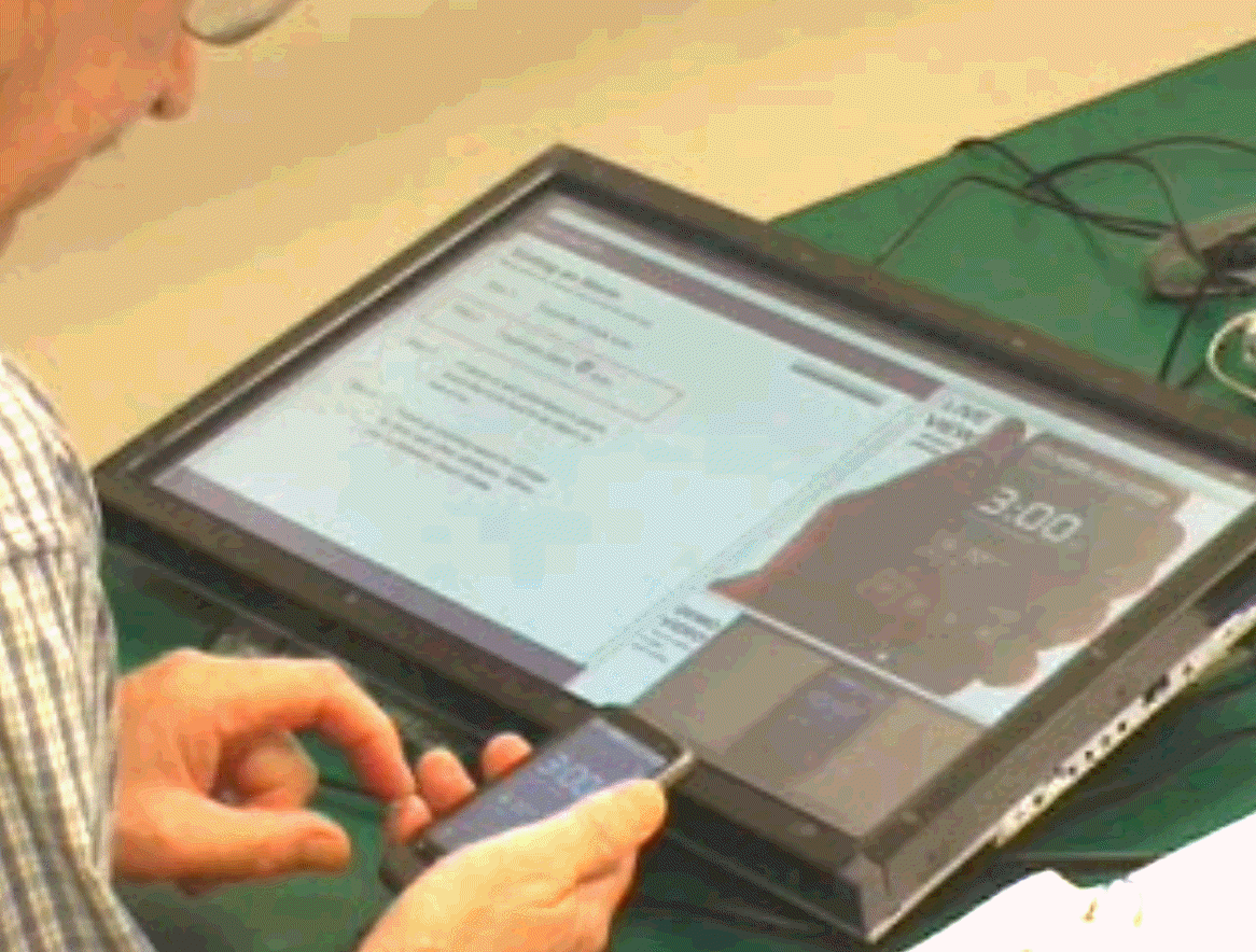
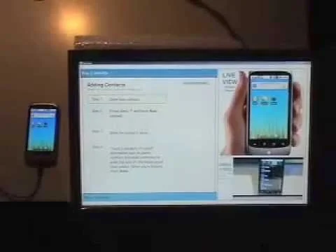
An additional display that is paired with a mobile device has the potential to help an older user learn to use the device. How can the display be used as a “scaffold” during the learning process, providing additional guidance not feasible on the device?
Process
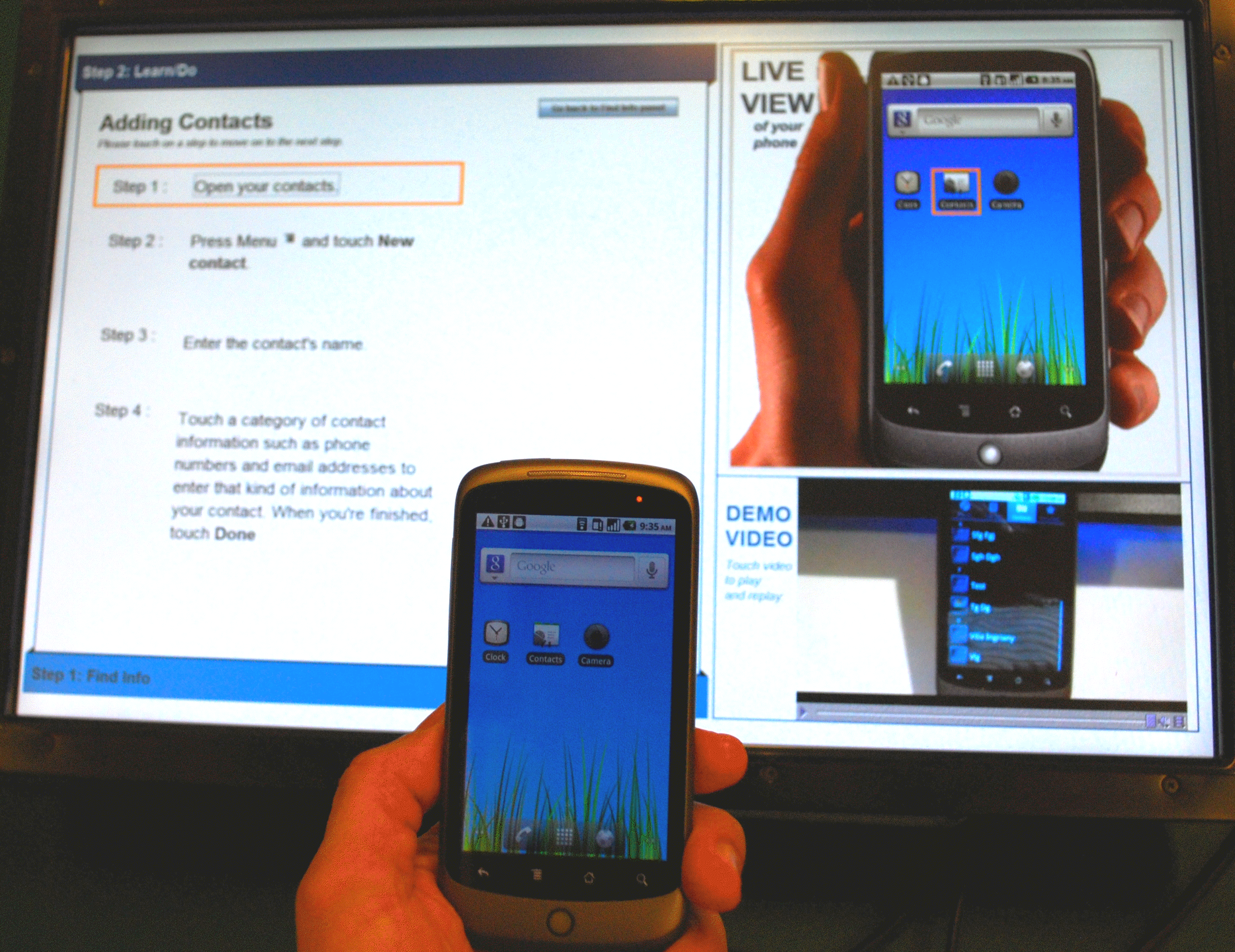
We designed and prototyped such a system, which we called Help Kiosk.
My role: Using results from a past project, as well as existing design guidelines focused on older adults, I led the design and evaluation of Help Kiosk. Drs. Joanna McGrenere (CS) and Peter Graf (Psych) supervised the work. Vilia Ingriany developed the prototype software, and helped run the user evaluation.
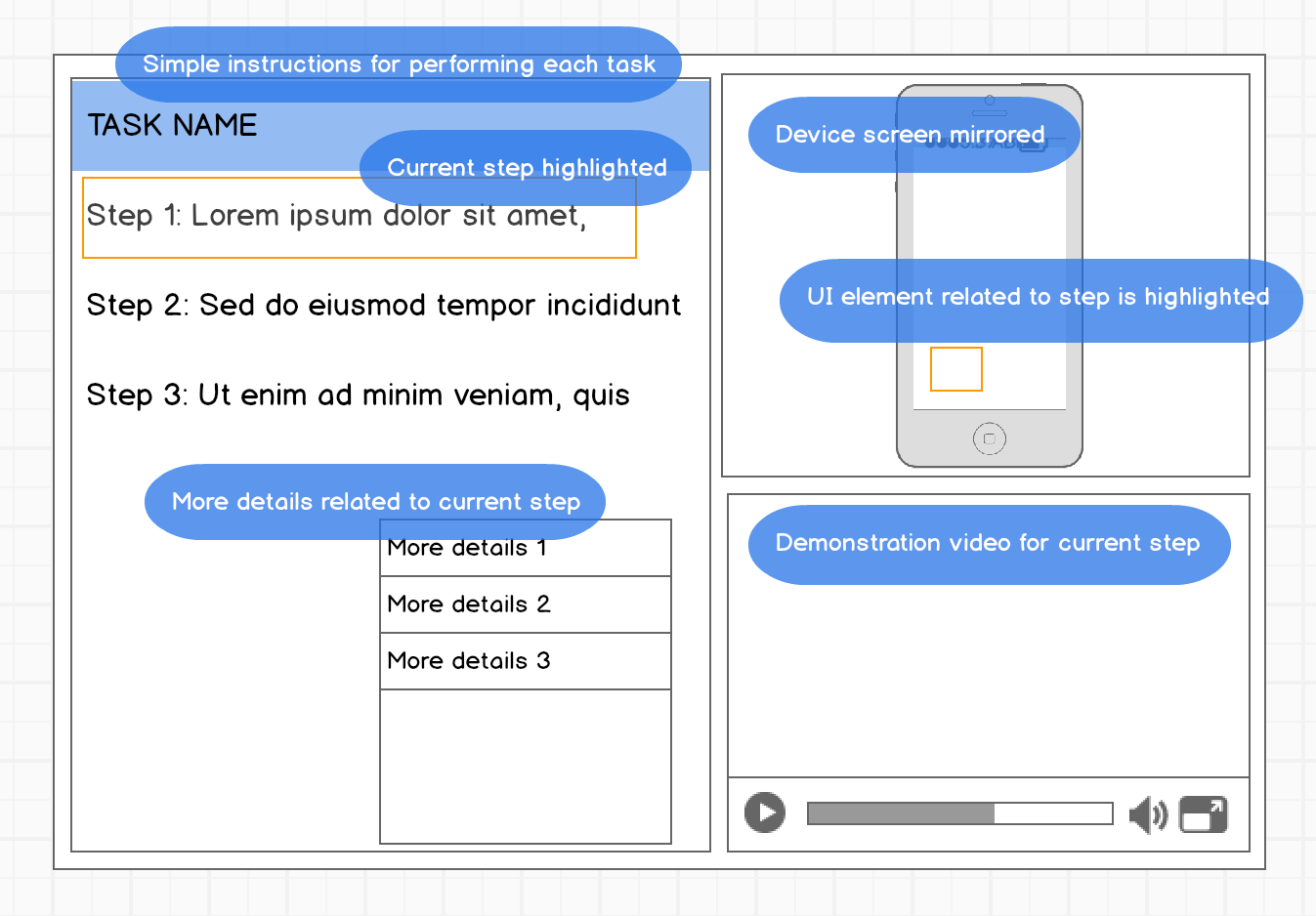
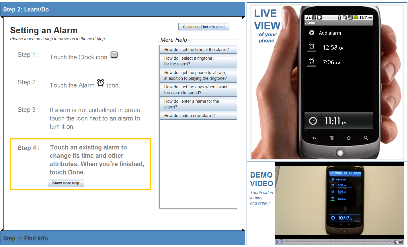
Design: We followed a number of design principles, including providing instructions in multiple ways and at two levels of detail, as well as cues to help the learner follow instructions.
Evaluation: We ran an initial evaluation with 6 older adults to see how it compared to a manual. Participants generally found Help Kiosk easy to use to learn to perform the given smart phone tasks. They found the simplified instructions and the demonstration videos useful in the learning process.
Outcome
We designed and prototyped a Help Kiosk system that older adults found useful. I was encouraged to see that even though some participants had expressed apprehension about using smart phones, participants generally reported that they were more comfortable about learning to use a smartphone after being exposed to Help Kiosk.
More details about this project can be found in our peer-reviewed article in the ACM Transactions on Accessible Computing journal.

